A distribution is the set of values a variable takes, together with how often each value shows up. The mean of life expectancy across countries is one number. The distribution behind that number might be one tight cluster of countries, or two separate humps, a richer world and a poorer one, averaging out to the same place. When I first loaded the World Development Indicators data I computed means for a while, and the means kept flattening exactly the part I wanted to see.
So this is a tour of seven seaborn plots, in the order the original notebook tried them: histogram, scatter, density, box, violin, heatmap, rug. Five of them are distribution plots in the strict sense, different views of one column holding one value per country. The scatter and the heatmap are cheats that stayed in, one for two columns at once, one for a whole matrix. For each plot I kept the code, the figure it produced, and a note on what it showed that the one before it could not.
Updated 2023. I wrote this in 2017 against seaborn’s old distplot helper. seaborn deprecated distplot in v0.11 (2020) and folded its job into histplot and displot, so I re-ran the notebook on seaborn 0.12 and the code blocks below use histplot(kde=True), kdeplot, and rugplot, passing their data by keyword. The plots and the reasoning are unchanged from the original.
One table, one prep pattern
The whole post runs off a single sqlite file. The data behind it is the World Bank’s World Development Indicators, packaged into one database.sqlite. You connect once, pull three tables, and you are set.
That database.sqlite is the classic Kaggle packaging of the World Bank data, the same file the code below queries, so the seven plots reproduce from the source rather than from my copy of it.
Grab the World Development Indicators dataset on Kaggle
%pylab inline

import pandas as pd
import seaborn as sns
import sqlite3


db_path = './data/world-development-indicators/database.sqlite'

conn = sqlite3.connect(db_path)
db = conn.cursor()
db.execute("SELECT name FROM sqlite_master WHERE type='table';")
print(db.fetchall())

data_countries = pd.read_sql_query('select * from Country',conn)
data_series = pd.read_sql_query('select * from Series',conn)
data_indicators = pd.read_sql_query('select * from Indicators',conn)
data_indicators is a long table. There is one row per CountryName x IndicatorName x Year, with the number itself in Value. That long shape is the substrate for everything below.
Most of the data-prep blocks below are the same four moves. You filter data_indicators down to the indicator strings you want. You drop aggregate rows by keeping only countries that carry a real Region. You sort and take each country’s last available year. You group to one row per country. Where a section needs two indicators side by side, it pivots them into columns at the end. I kept the blocks verbatim so each one is runnable on its own. Once you have seen the histogram prep you have seen the pattern, and you can skim the rest for the one line that changes: selected_indicators.
Histogram: one hump or two?
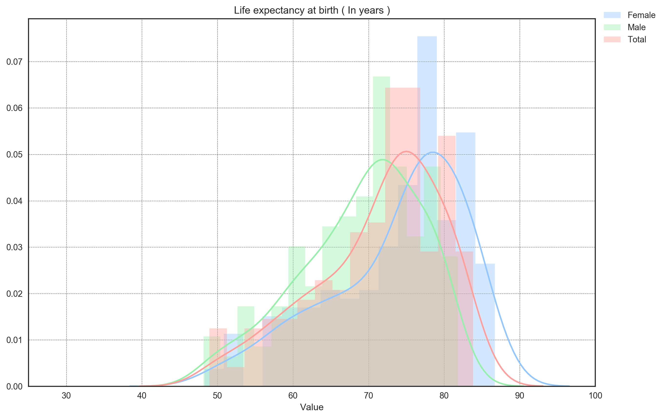
First plot in the notebook, and the simplest: life expectancy at birth, one value per country, dropped into bins. A histogram is the fastest way to see whether the values pile up in one place or in two.
# Data Prep

selected_indicators = ['Life expectancy at birth, female (years)',
                       'Life expectancy at birth, male (years)',
                       'Life expectancy at birth, total (years)']
countries = data_countries.CountryCode[data_countries.Region!=''].unique()
condition = data_indicators.IndicatorName.isin(selected_indicators)

data_plot = data_indicators.loc[condition,:]
condition = data_plot.CountryCode.isin(countries)
data_plot = data_plot.loc[condition,:]
data_plot.sort_values(['CountryName','IndicatorName','Year'], inplace=True)

data_plot = data_plot.groupby(['CountryName','IndicatorName'], as_index=False).last()
data_plot[['feature','type']] = data_plot['IndicatorName'].str.split(', ',expand=True)
data_plot.reset_index(inplace=True, drop=True)

# Visualisation

nbins = 15
sns.set(style="white",
        palette="pastel",
        color_codes=True,
        rc={'figure.figsize':(12,8),
            'figure.dpi':500})

sns.histplot(data_plot.Value[data_plot.type=='female (years)'], bins=nbins, kde=True)
sns.histplot(data_plot.Value[data_plot.type=='male (years)'], bins=nbins, kde=True)
sns.histplot(data_plot.Value[data_plot.type=='total (years)'], bins=nbins, kde=True)
plt.legend(['Female', 'Male', 'Total'], bbox_to_anchor=(1.12,1.04))
plt.xlim((25,100))
plt.grid(color='black',linestyle='-.',linewidth=0.25)
plt.title('Life expectancy at birth ( In years )')
This draws three overlaid histograms, female, male and total, each with its KDE curve laid on top via kde=True. The nbins = 15 and plt.xlim((25,100)) are the two knobs that matter. The bin count decides how coarse the shape reads, and the x-limit frames the same 25-to-100 range for all three so they overlay on one axis. One thing to watch with the overlay is occlusion. The code sets no alpha and no element='step', so the filled bars can hide each other where they stack, and the KDE curves do most of the work of telling the three apart.
Scatter: when one number per country becomes two
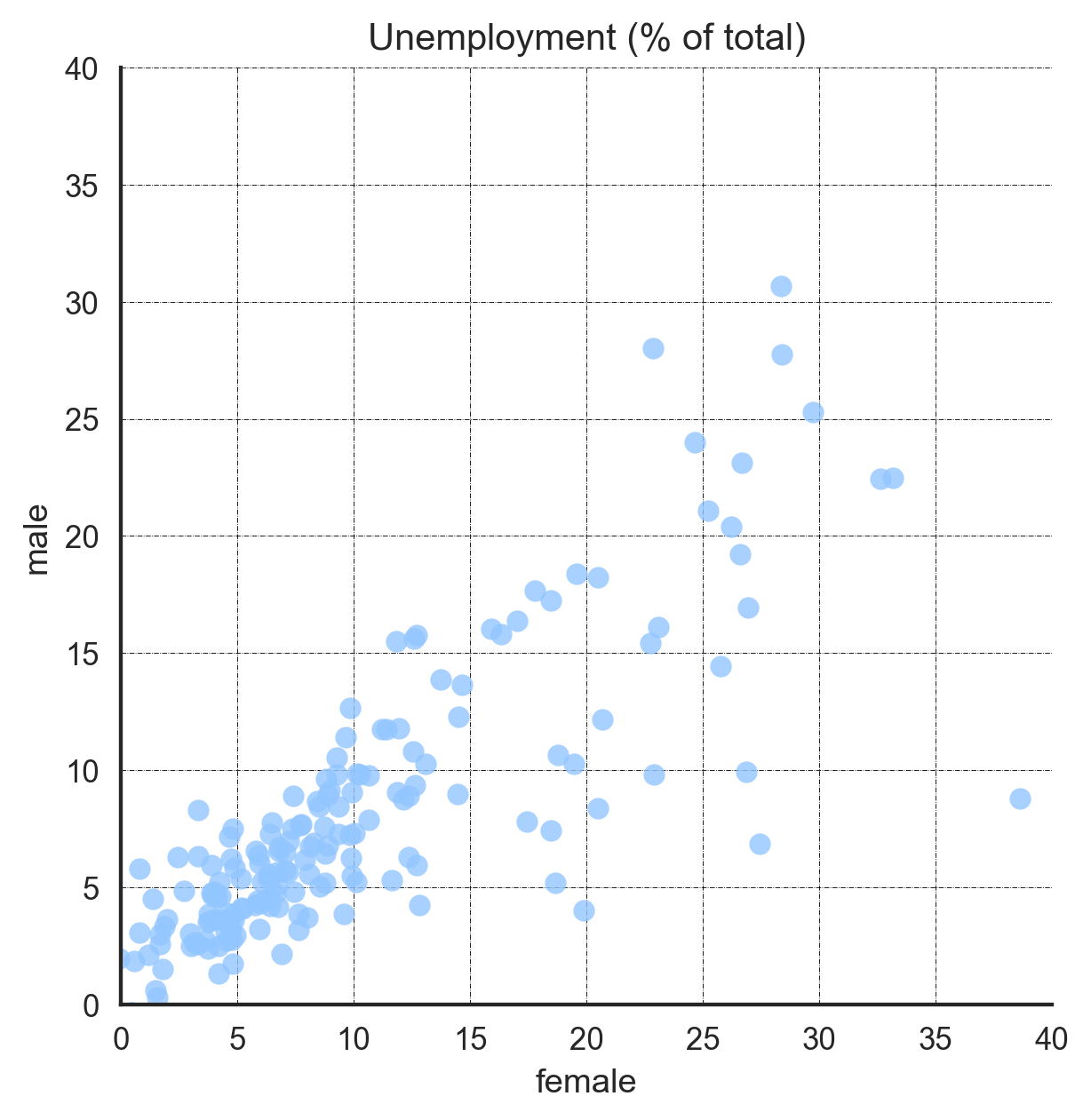
Here is the first cheat. A scatter reads two columns, not one, so it is not a distribution plot in the strict sense. It went into the notebook anyway, because right after looking at one number per country I wanted two, male and female unemployment, and the question of whether they move together.
# Data Prep

selected_indicators = ['Unemployment, female (% of female labor force)',
                       'Unemployment, male (% of male labor force)']

countries = data_countries.CountryCode[data_countries.Region!=''].unique()
condition = data_indicators.IndicatorName.isin(selected_indicators)

data_plot = data_indicators.loc[condition,:]
condition = data_plot.CountryCode.isin(countries)
data_plot = data_plot.loc[condition,:]
data_plot.sort_values(['CountryName','IndicatorName','Year'], inplace=True)

data_plot = data_plot.groupby(['CountryName','IndicatorName'], as_index=False).last()
data_plot[['feature','type']] = data_plot['IndicatorName'].str.split(', ',expand=True)
data_plot.reset_index(inplace=True, drop=True)
data_plot['type'] = data_plot.type.str.replace(' \(% of male labor force\)','')
data_plot['type'] = data_plot.type.str.replace(' \(% of female labor force\)','')
data_plot = data_plot.pivot_table(values='Value',index='CountryName',columns='type')

# Visualisation

sns.set(style="white",
        palette="pastel",
        rc={'figure.figsize':(7,5),
            'figure.dpi':500})

sns.lmplot(x = 'female', y = 'male', data = data_plot, fit_reg=False, x_jitter=1.5, y_jitter=1.5)
plt.xlim((0,40))
plt.ylim((0,40))
plt.grid(color='black', linestyle='-.', linewidth=0.25)
plt.title('Unemployment (% of total)',)
plt.savefig('./plots/02.scatter.png',orientation='landscape',dpi=500);
fit_reg=False keeps lmplot from drawing a regression line, because a fitted slope would average the countries into one trend and smooth away the cloud this plot exists to show. The x_jitter=1.5 and y_jitter=1.5 nudge overlapping points apart, so a stack of countries at the same rate does not hide behind one marker. plt.xlim((0,40)) with plt.ylim((0,40)) puts both axes on the same scale, which is what makes the diagonal readable. Points on the line are countries where male and female unemployment match, and the spread off it is the gap between them.
Density: a histogram without the bin argument
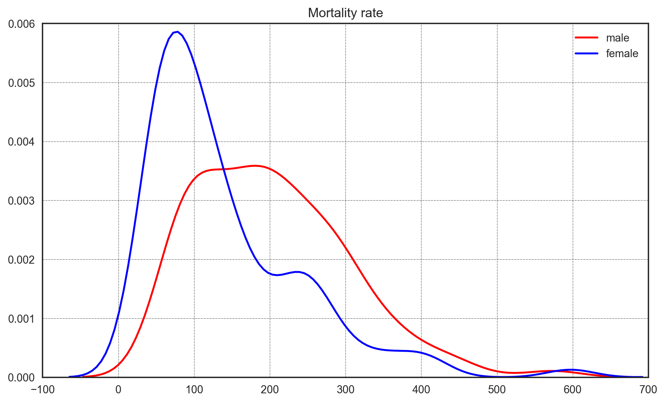
A kernel density estimate is the histogram’s smooth cousin. Back at the histogram the bin count was the setting to defend; here the steps melt into a curve, and the setting hides instead of going away. It comes back as the bandwidth, buried inside seaborn’s default Scott rule, and most of us never touch it. Here it is adult mortality, male and female, side by side.
# Data Prep

selected_indicators = ['Mortality rate, adult, female (per 1,000 female adults)',
                       'Mortality rate, adult, male (per 1,000 male adults)']

countries = data_countries.CountryCode[data_countries.Region!=''].unique()
condition = data_indicators.IndicatorName.isin(selected_indicators)

data_plot = data_indicators.loc[condition,:]
condition = data_plot.CountryCode.isin(countries)
data_plot = data_plot.loc[condition,:]
data_plot.sort_values(['CountryName','IndicatorName','Year'], inplace=True)

data_plot = data_plot.groupby(['CountryName','IndicatorName'], as_index=False).last()
data_plot[['feature','type']] = data_plot['IndicatorName'].str.split(', adult, ',expand=True)
data_plot.reset_index(inplace=True, drop=True)
data_plot['type'] = data_plot.type.str.replace(' \(per 1,000 female adults\)','')
data_plot['type'] = data_plot.type.str.replace(' \(per 1,000 male adults\)','')
data_plot = data_plot.pivot_table(values='Value',index='CountryName',columns='type')

# Visualisation

sns.set(style="white",
        palette="pastel",
        color_codes=True,
        rc={
            'figure.figsize':(10,6),
            'figure.dpi':200
           })

sns.kdeplot(data=data_plot, x='male', color='red')
sns.kdeplot(data=data_plot, x='female', color='blue')
plt.grid(color='black',linestyle='-.', linewidth=0.25)
plt.title('Mortality rate')
plt.ylim((0,0.006))
plt.xlim((-100,700))
plt.savefig('./03.density.png');
This draws two kdeplot curves, male in red and female in blue. The plt.ylim((0,0.006)) and plt.xlim((-100,700)) fix the frame so the two densities are comparable. The negative left edge is the tell. The kernel happily smears probability mass below zero, into mortality rates that cannot exist. That is the cost of the lens: it buys us a clean curve by inventing a little continuity at the edges.
Box and violin: now group by region
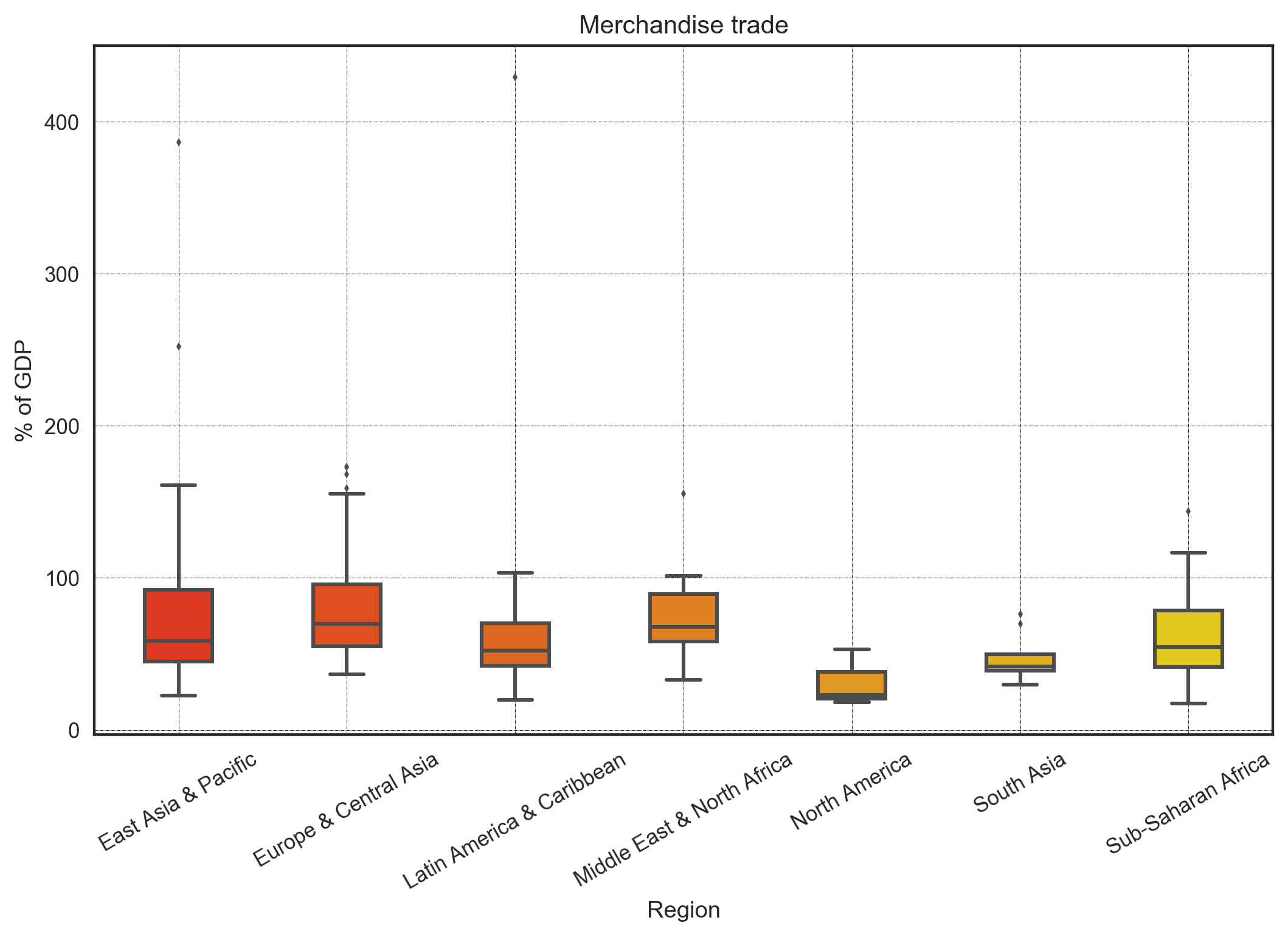
So far the column stayed ungrouped. The next thing I wanted was the same shape split by region, and seaborn has two plots for that. A box plot keeps the five-number summary per group, the median line and the quartile box with its whiskers, and throws the rest away. A violin keeps the box and adds back the kernel shape the box discarded.
First the boxplot. This one is merchandise trade as a share of GDP, split by world region.
# Data Prep

selected_indicators = ['Merchandise trade (% of GDP)']

countries = data_countries.CountryCode[data_countries.Region!=''].unique()
condition = data_indicators.IndicatorName.isin(selected_indicators)

data_plot = data_indicators.loc[condition,:]
condition = data_plot.CountryCode.isin(countries)
data_plot = data_plot.loc[condition,:]
data_plot.sort_values(['CountryName','IndicatorName','Year'], inplace=True)

data_plot = data_plot.groupby(['CountryName','IndicatorName'], as_index=False).last()
data_plot.reset_index(inplace=True, drop=True)
data_plot['Region'] = data_plot.merge(right=data_countries,on='CountryCode',how='left')['Region']

# Visualisation

columns_order = sorted(data_plot.Region.unique())

sns.set(style="white",
        palette="pastel",
        color_codes=True,
        rc={
            'figure.figsize':(10,6),'figure.dpi':200
           })

sns.boxplot(x='Region',
            y='Value',
            palette='autumn',
            order=columns_order,
            width=0.4,
            fliersize=3,
            data=data_plot);
plt.grid(color='black',linestyle='-.', linewidth=0.25)
plt.xticks(rotation=30)
plt.title('Merchandise trade')
plt.ylabel('% of GDP');
plt.savefig('./04.boxplot.png');
width=0.4 keeps the boxes slim so the region labels breathe, and fliersize=3 shrinks the outlier dots that would otherwise crowd the high-trade regions. You get one box per region, each a five-number summary. The comparison you get for free is which regions trade more relative to their size and which spread wider. The sorted(data_plot.Region.unique()) is deliberate. %pylab inline pulls numpy.sort into the namespace as a bare sort, so I reach for the builtin sorted to be explicit about fixing the column order across every grouped plot below.
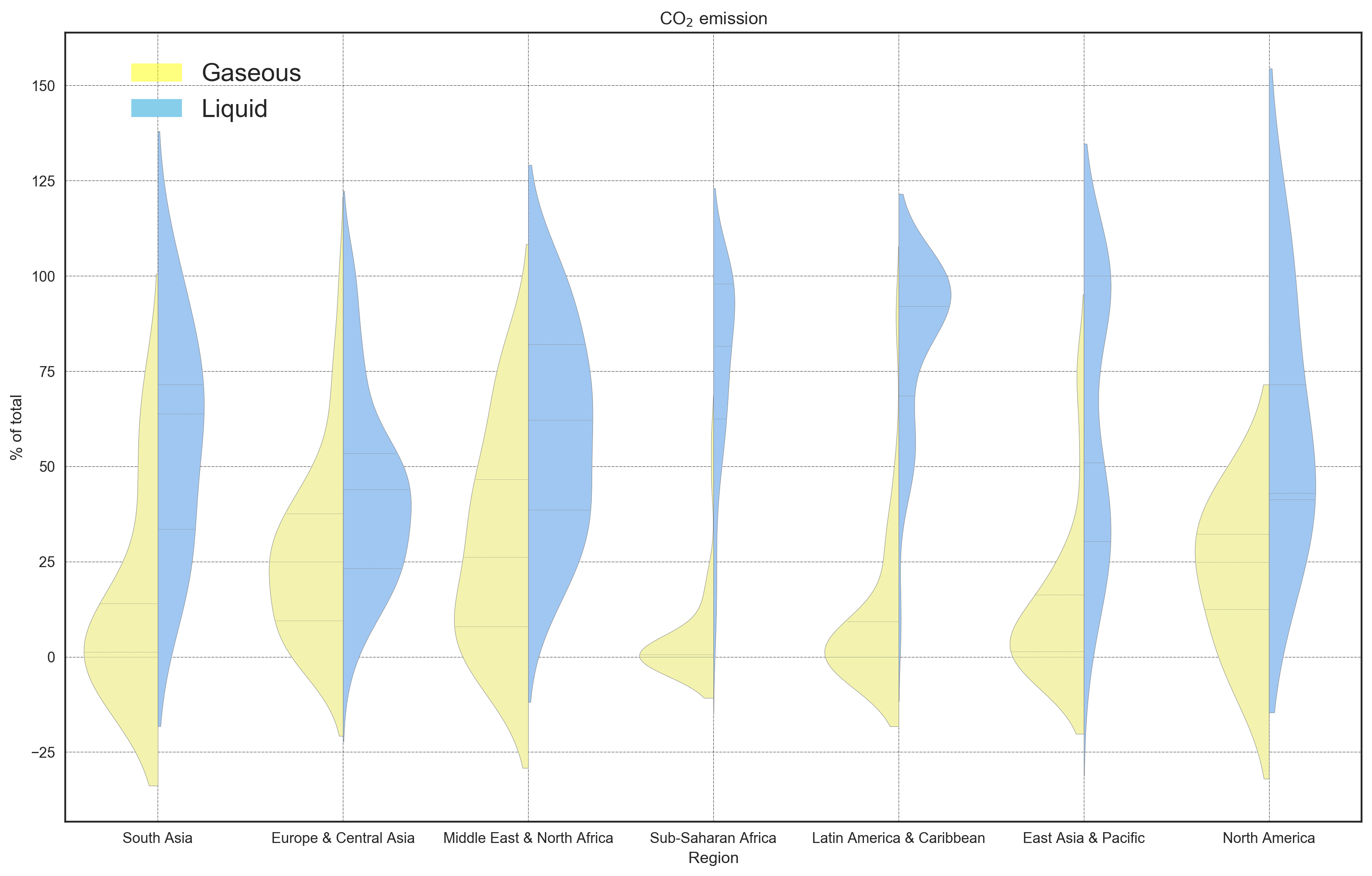
Now the violin, which keeps the shape the box drops. This one also splits each region in half, gaseous against liquid CO2 emissions.
# Data Prep

selected_indicators = [ 'CO2 emissions from gaseous fuel consumption (% of total)',
                        'CO2 emissions from liquid fuel consumption (% of total)']

countries = data_countries.CountryCode[data_countries.Region!=''].unique()
condition = data_indicators.IndicatorName.isin(selected_indicators)

data_plot = data_indicators.loc[condition,:]
condition = data_plot.CountryCode.isin(countries)
data_plot = data_plot.loc[condition,:]
data_plot.sort_values(['CountryName','IndicatorName','Year'], inplace=True)

data_plot = data_plot.groupby(['CountryName','IndicatorName'], as_index=False).last()
data_plot.reset_index(inplace=True, drop=True)
data_plot['Region'] = data_plot.merge(right=data_countries,on='CountryCode',how='left')['Region']

# Visualisation

import matplotlib.patches as mpatches

columns_order = sorted(data_plot.Region.unique())

sns.set(style="white",
        palette="pastel",
        color_codes=True,
        rc={
            'figure.figsize':(16,10),'figure.dpi':250
           })
sns.violinplot(x ='Region',
               y='Value',
               hue='IndicatorName',
               linewidth=0.25,
               inner="quart",
               palette={"CO2 emissions from gaseous fuel consumption (% of total)": "y",
                        "CO2 emissions from liquid fuel consumption (% of total)": "b"},
               data=data_plot,
               split=True)
plt.grid(color='black',linestyle='-.', linewidth=0.25)
plt.title('CO$_2$ emission')
plt.ylabel('% of total')

gas_patch = mpatches.Patch(color='yellow', label='Gaseous',alpha=0.5)
liquid_patch = mpatches.Patch(color='skyblue', label='Liquid')
plt.legend(handles=[gas_patch, liquid_patch], bbox_to_anchor=(0.2, 0.99), fontsize='x-large')
plt.savefig('./plots/05.violinplot.png', dpi=250, bbox_inches='tight');
split=True with inner="quart" is the trick that earns the violin its keep. Gaseous goes on one side, liquid on the other, with quartile lines drawn inside each half so you still get the box-style summary without a second plot. Where a region’s silhouette bulges in two places, you are looking at a cluster a box would have flattened into one. Of the seven figures here, this one is still my favorite.
Heatmap: visualize a whole matrix
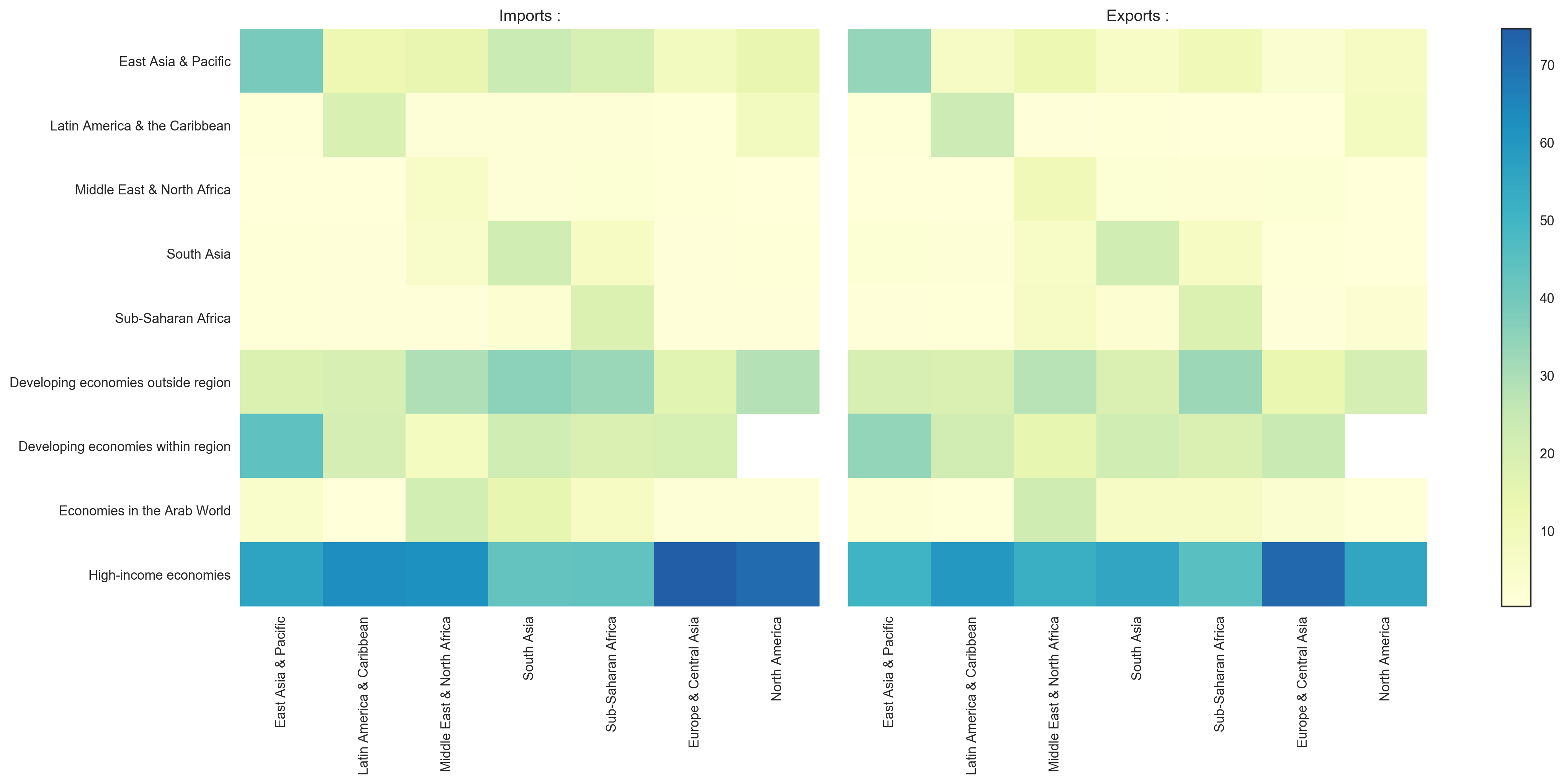
The second cheat. By this point the notebook had drifted from single indicators to a whole matrix of them, merchandise trade split by region and by destination. A matrix spends both position axes on its rows and columns, so color is the only channel left to carry the value, and that is what a heatmap is.
# Data Prep

selected_indicators_export = [
    'Merchandise exports to developing economies in East Asia & Pacific (% of total merchandise exports)',
    'Merchandise exports to developing economies in Latin America & the Caribbean (% of total merchandise exports)',
    'Merchandise exports to developing economies in Middle East & North Africa (% of total merchandise exports)',
    'Merchandise exports to developing economies in South Asia (% of total merchandise exports)',
    'Merchandise exports to developing economies in Sub-Saharan Africa (% of total merchandise exports)',
    'Merchandise exports to developing economies outside region (% of total merchandise exports)',
    'Merchandise exports to developing economies within region (% of total merchandise exports)',
    'Merchandise exports to economies in the Arab World (% of total merchandise exports)',
    'Merchandise exports to high-income economies (% of total merchandise exports)'
]

selected_indicators_imports = [
    'Merchandise imports from developing economies in East Asia & Pacific (% of total merchandise imports)',
    'Merchandise imports from developing economies in Latin America & the Caribbean (% of total merchandise imports)',
    'Merchandise imports from developing economies in Middle East & North Africa (% of total merchandise imports)',
    'Merchandise imports from developing economies in South Asia (% of total merchandise imports)',
    'Merchandise imports from developing economies in Sub-Saharan Africa (% of total merchandise imports)',
    'Merchandise imports from developing economies outside region (% of total merchandise imports)',
    'Merchandise imports from developing economies within region (% of total merchandise imports)',
    'Merchandise imports from economies in the Arab World (% of total merchandise imports)',
    'Merchandise imports from high-income economies (% of total merchandise imports)'
]

countries = data_countries.CountryCode[data_countries.Region!=''].unique()
condition = data_indicators.IndicatorName.isin(selected_indicators_export)
data_plot = data_indicators.loc[condition,:]
condition = data_plot.CountryCode.isin(countries)
data_plot = data_plot.loc[condition,:]
data_plot.sort_values(['CountryName','IndicatorName','Year'], inplace=True)
data_plot = data_plot.groupby(['CountryName','IndicatorName'], as_index=False).last()
data_plot.reset_index(inplace=True, drop=True)
data_plot['Region'] = data_plot.merge(right=data_countries,on='CountryCode',how='left')['Region']
data_export = data_plot.pivot_table(values='Value',columns='Region',index='IndicatorName')


countries = data_countries.CountryCode[data_countries.Region!=''].unique()
condition = data_indicators.IndicatorName.isin(selected_indicators_imports)
data_plot = data_indicators.loc[condition,:]
condition = data_plot.CountryCode.isin(countries)
data_plot = data_plot.loc[condition,:]
data_plot.sort_values(['CountryName','IndicatorName','Year'], inplace=True)
data_plot = data_plot.groupby(['CountryName','IndicatorName'], as_index=False).last()
data_plot.reset_index(inplace=True, drop=True)
data_plot['Region'] = data_plot.merge(right=data_countries,on='CountryCode',how='left')['Region']
data_import = data_plot.pivot_table(values='Value',columns='Region',index='IndicatorName')

# Visualisation

sns.set(style="white",
        color_codes=True,
        rc={
            'figure.figsize':(20,8),
            'figure.dpi':250
           })
fig, (imports, exports) = plt.subplots(1, 2, sharex=True)

im1 = sns.heatmap(data_import.loc[:,xlabels],
                  ax=imports,
                  center=50,
                  cbar=False,
                  cmap="YlGnBu")
imports.set_yticklabels(ylabels)
imports.set_ylabel('')
imports.set_xlabel('')
imports.set_title('Imports :');

im2 = sns.heatmap(data_export.loc[:,xlabels],
                  ax=exports,
                  center=50,
                  yticklabels=False,
                  cbar=False,
                  cmap="YlGnBu")
exports.set_ylabel('')
exports.set_xlabel('')
exports.set_title('Exports :');
fig.subplots_adjust(wspace=0.05, hspace=0)

mappable = im1.get_children()[0]
fig.colorbar(mappable, ax = [imports,exports],orientation = 'vertical')
plt.savefig('./plots/06.heatmap.png', dpi=250, bbox_inches='tight');
Two heatmaps share a colorbar, imports on the left and exports on the right. center=50 anchors the colormap so the eye reads above and below the halfway mark, and wspace=0.05, hspace=0 pulls the panels tight so they read as one figure. One line here needs a stub before it runs. This block references xlabels and ylabels that I defined further up in the original notebook and never carried into the post. They are just the column order and the row labels for the two pivot tables, so the quickest stub is to derive them from what is already in scope:
xlabels = sorted(data_import.columns)
ylabels = [name.split(' (% ')[0] for name in data_import.index]
Rug: the raw data under everything
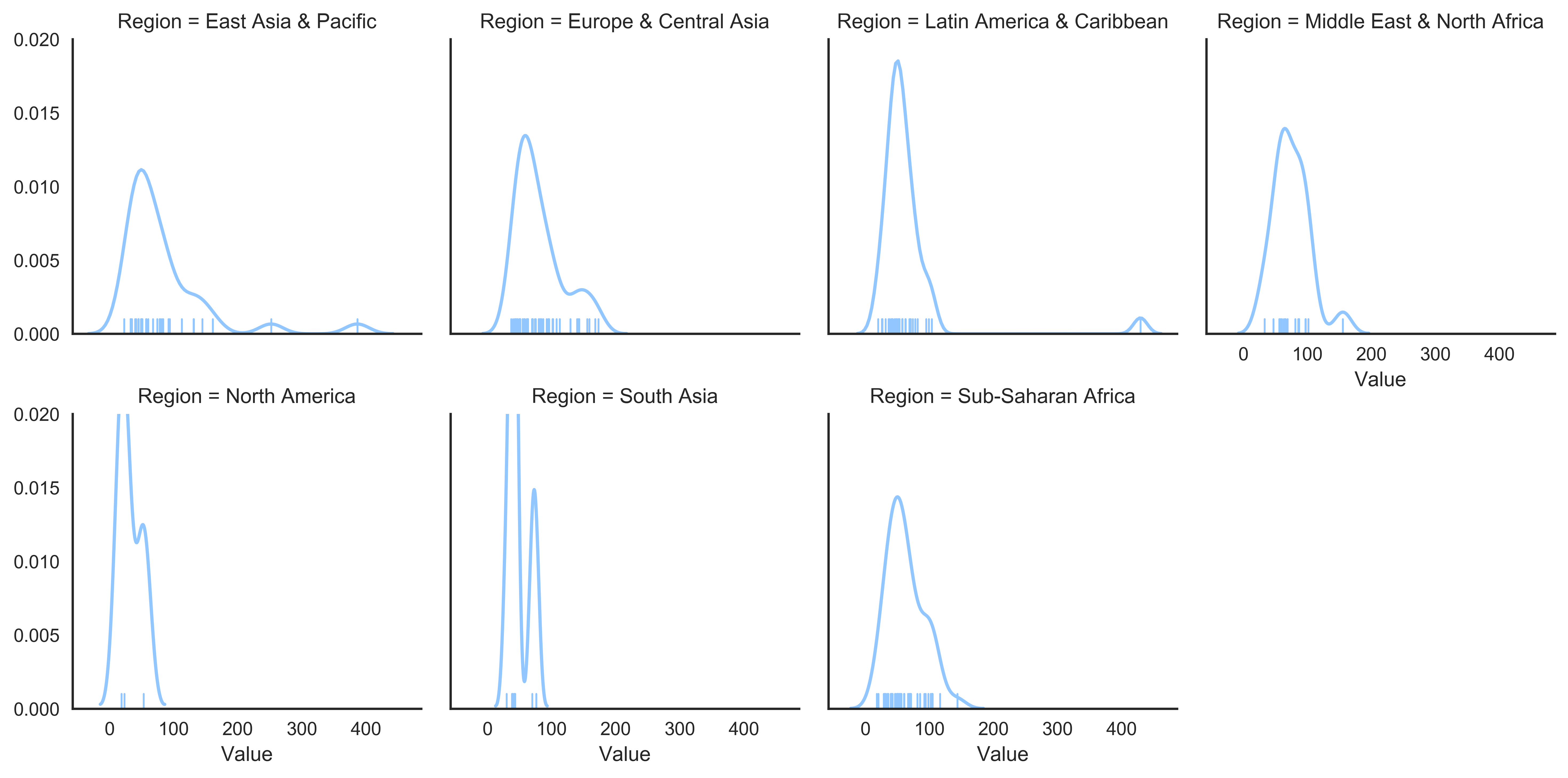
Close the tour by going all the way back down. Every distribution plot above binned or smoothed the column into a summary first. The rug does none of that. It draws every country as a single tick, the raw marks the other six plots were built on top of.
# Data Prep

selected_indicators = ['Merchandise trade (% of GDP)']

countries = data_countries.CountryCode[data_countries.Region!=''].unique()
condition = data_indicators.IndicatorName.isin(selected_indicators)

data_plot = data_indicators.loc[condition,:]
condition = data_plot.CountryCode.isin(countries)
data_plot = data_plot.loc[condition,:]
data_plot.sort_values(['CountryName','IndicatorName','Year'], inplace=True)

data_plot = data_plot.groupby(['CountryName','IndicatorName'], as_index=False).last()
data_plot.reset_index(inplace=True, drop=True)
data_plot['Region'] = data_plot.merge(right=data_countries,on='CountryCode',how='left')['Region']

columns_order = sorted(data_plot.Region.unique())

# Visualisation

sns.set(style="white",
        palette="pastel",
        color_codes=True,
        rc={
            'figure.figsize':(12,8),'figure.dpi':500
           })

g = sns.FacetGrid(data_plot,
                  col="Region",
                  col_wrap=4,
                  col_order=columns_order,subplot_kws={'ylim':(0,0.02)})
g.map(sns.kdeplot, "Value")
g.map(sns.rugplot, "Value");
plt.savefig('./plots/07.rugplot.png', dpi=500, bbox_inches='tight');
col_wrap=4 lays the regions out four to a row as a small-multiples grid. subplot_kws={'ylim':(0,0.02)} pins every panel to the same y-range so the densities are comparable across regions, and each panel layers a kdeplot curve over a rugplot of the actual ticks. The rug is the check on the curve above it: where the density draws a smooth bump, the ticks show whether that bump rests on twenty countries or on three. It is also where the tour hits its limit. None of these seven plots test anything. They form hypotheses, they do not confirm them. A violin bulging in two places just tells you where to look next.
Which one to reach for
What I settled on after this notebook: one column, histogram first, density when the bins get in the way. Two numbers per country, scatter. Groups, box, then violin if the boxes look suspiciously tidy. A matrix, heatmap. And a rug under any curve that looks smoother than the data has a right to be.
I wrote this down mostly so I stop re-deriving it every time I open a new dataset. If you order these differently, or there is a distribution plot I should have tried and did not, I would like to hear about it.