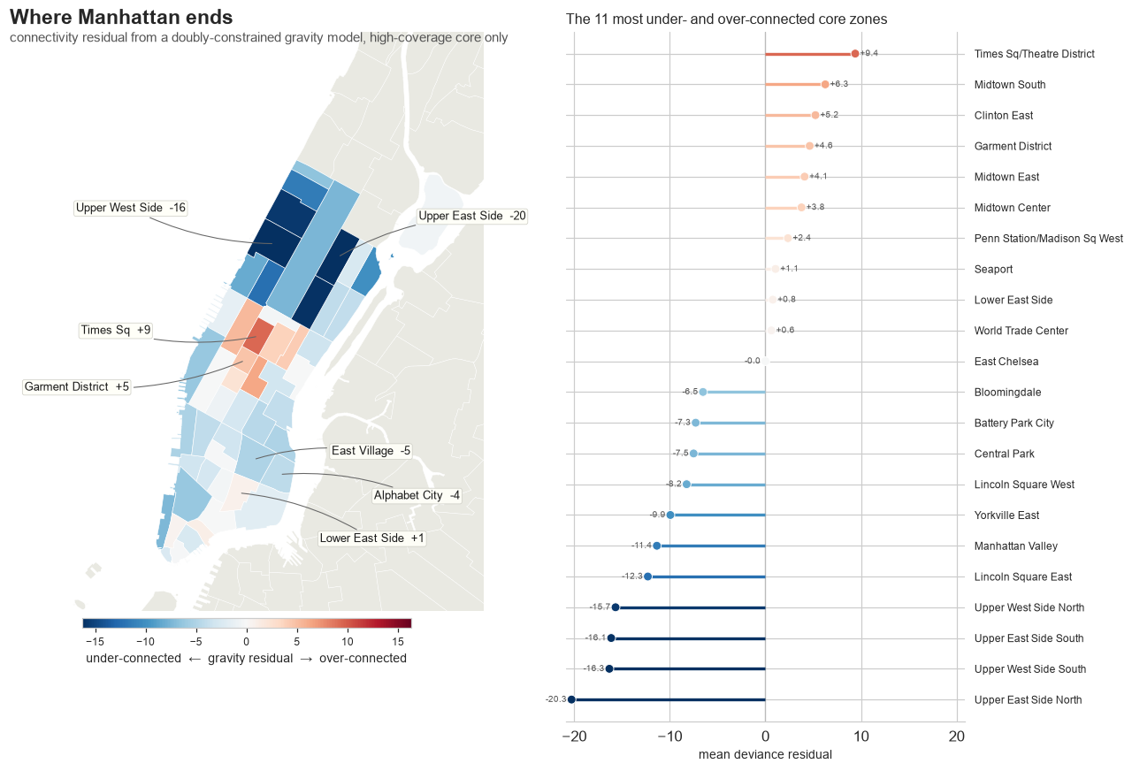
Before any of the method, here is the thing the rest of this post exists to explain: an interactive map of New York where the East Village, sitting dead-center in Manhattan, lights up not like the dense core it geographically belongs to but like a far suburb that the city’s taxi flow keeps at arm’s length, and a single directed graph that, once I had built it and weighted it and pushed on it from every angle I could think of, turned out to be enough to account for that reading and a dozen others like it.

Explore the interactive project Browse the code on GitHub

In 2015, New York City logged 146 million yellow-taxi trips, and the whole of what follows is one object built out of them and then looked at from a series of different angles. I build the directed graph, I weight its edges, I let it partition the city, I subtract out what volume and geography already predict so the residual map above can speak, I re-time the same flows by hour, I stress-test the structure under node removal and against null models, and then I re-run the entire pipeline across a decade to see whether the shape outlasts the volume. Every section below is a single mutation or lens on that one graph rather than a separate finding standing on its own, so if the suburb map at the top is the part you came for, you are already looking at the payoff and the rest is the machinery that earns it.

One scope note before the arrows. This is yellow taxis only, which is one observation channel into how the city moves, not all of it. By 2015 ride-hailing and green cabs already carried a growing slice of trips, so everything below is a claim about yellow-taxi flow, not about all travel. That single bias shapes how I read the flagship map you just saw and the decade panel that closes the piece, so I carry it the whole way through.

The piece runs long because looking at one substrate from this many angles needs the network-science diagnostics, not just the headlines. If you only want the city-structure views, the decade panel at the very end stands on its own; skip the diagnostics section and you lose none of the story, since those are simply more views of the same object rather than a separate track.

Building the substrate

The Taxi and Limousine Commission distributes the trip dataset publicly, one row per trip, with a pickup point, a dropoff point, distance, fare, and timestamps[1], and the entire post rests on one move that turns those rows into a single object I can then examine repeatedly: a trip becomes a directed edge from its pickup node to its dropoff node, and every trip between the same pair collapses into one weighted edge whose weight is the trip count, so that an entire year of individual rides settles into a graph small enough to hold in the head and structured enough to interrogate.

A taxi trip becomes a directed edge between two location nodes On the left, several faint individual taxi trips run from a pickup area to a dropoff area. On the right, those trips collapse into one node-to-node arrow weighted by trip count. pickups dropoffs raw trips A B one weighted edge
The core abstraction. Many individual taxi runs between the same two places collapse into a single directed, weighted edge from node A to node B, with the trip count as its weight.

The node is a taxi zone by design, because TLC distributes its trips pre-aggregated to 263 taxi zones, so a zone is the natural unit of the graph, and a single year resolves to a few hundred nodes rather than a few hundred thousand raw coordinates, which is the difference between an object you can partition and stress-test and a point cloud you can only sample.

Cleaning is conservative, since the whole point is to keep the substrate honest before I start reading anything off it. Of 146,039,231 raw 2015 rows, 142,199,201 survive (97.4%), after dropping invalid zone ids, non-positive durations, durations outside one to 360 minutes, fares outside a cent to a thousand dollars, and distances outside zero to a hundred miles. Intra-zone trips, where pickup and dropoff land in the same zone, are 4.54% of trips; they stay in the edge table but are excluded from every network and spatial metric, because a self-loop has zero distance and breaks distance-based methods. The directed graph that comes out carries about 135.7M trips across 262 active nodes and 42,347 directed edges, of which 7,945 carry more than 500 trips in the year, at a density of about 0.62, so this is a near-complete graph where most zone pairs exchange at least some taxis, with a mean trip distance of 2.25 miles. That density figure recurs, because it quietly poisons several of the network-science tests later on, and the first time it bites is the diagnostics section.

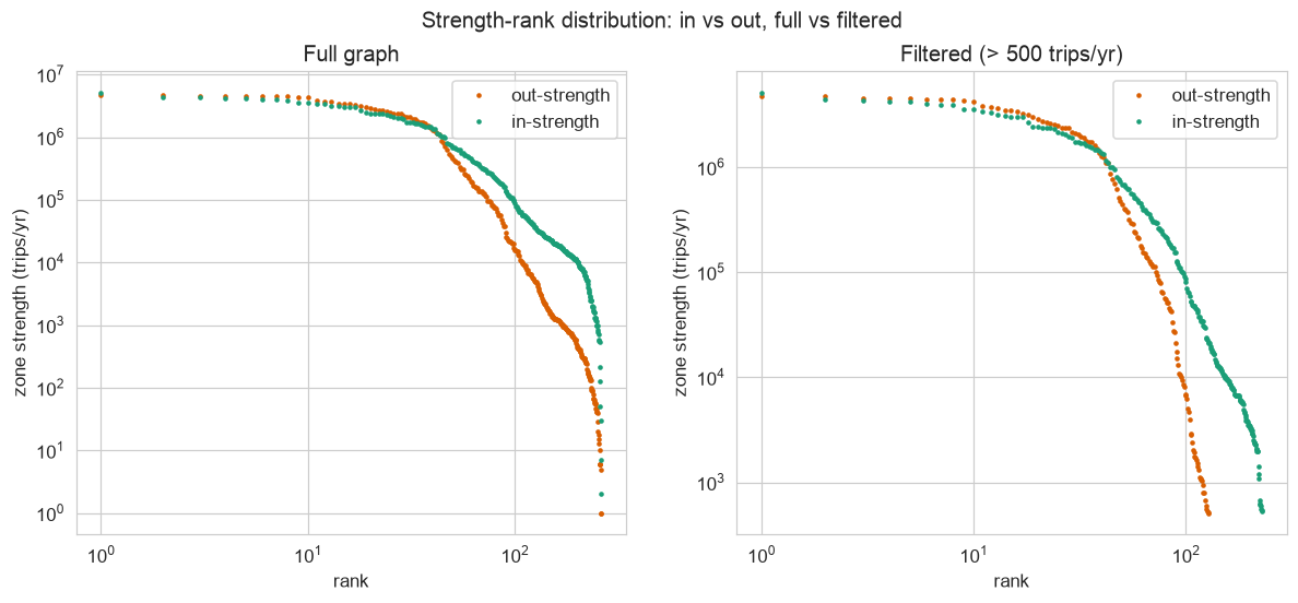
A directed graph has hubs, and the first lens I point at the substrate is simply whether in-flow and out-flow read the same when you rank the zones by each. They do not.

Rank plots of per-zone in-strength and out-strength, both heavy-tailed but with distinct shapes
Zone strength rank plots. In-strength and out-strength have visibly distinct shapes, so the flow is genuinely directed, and both tails are heavy: a handful of zones dominate the flow.

The two curves are heavy-tailed and they are not mirror images of each other, and that asymmetry is the first real structure the substrate gives up, the kind of thing you would never see in the raw rows but that the graph makes immediate, and it quietly sets up two things that recur as I keep turning the object over: the hubs come in two opposite kinds, and the question of whether those heavy tails are an actual power law has to wait for a proper test that the same heavy tails will eventually fail.

Weighting it: two kinds of hub

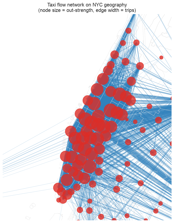
Drawn on real geography, with node size set by out-strength and edge width by annual trips, the same graph sorts the city into clear tiers the moment you let the weights speak[2].

The flow network drawn on Manhattan-core geography, node size set by out-strength and edge width by annual trips
The flow network on its real geography. Node size encodes out-strength, edge width annual trips. The Manhattan core, the Upper East and West Sides, and downtown dominate; transport hubs double as network hubs.

The transport hubs are the network hubs and the office districts are next, but the more interesting reading is that two zones can pull the same large volume in completely different ways, and the lens that separates them is trips per distinct source, which is in-strength divided by the number of distinct origins a zone draws from, a number that costs almost nothing to compute off the weighted edge table yet cleanly splits hubs the eye would lump together.

An inner-city hub versus an airport-style node Left: many arrows converge from a few clustered places into one high-in-degree hub. Right: arrows arrive from many scattered places into one node with a lower trips-per-source ratio. hub few sources, huge in-degree Penn Station / MSG airport many scattered sources, lower ratio
The asymmetry the strength plots pull apart. An inner-city draw pulls from a few nearby places, so trips per source runs high; an airport pulls from everywhere, so trips per source stays low. Similar trip totals, opposite shapes.

The numbers split cleanly along that ratio. Midtown Center pulls 22,929 trips per distinct origin, Times Square 18,664, Penn Station 17,399, the East Village 16,143, and these are the inner-city draws, enormous volume converging from a limited, mostly Manhattan set of origins. The airports invert the ratio, with LaGuardia at 7,289 trips per source and JFK at only 4,510, because they draw their volume from a great many scattered places: roughly 240 of 260-odd origin zones feed each airport, against the inner-city draws that pull from a tighter Manhattan set. The discriminator is source spread, not headline volume, and the same weighted graph holds both kinds of hub without my having to label them by hand.

If you stop sizing nodes by hub strength and instead let the graph regroup the city by who trades with whom, the districts it draws ignore the borough lines entirely[3].

Partitioning it: four functional districts

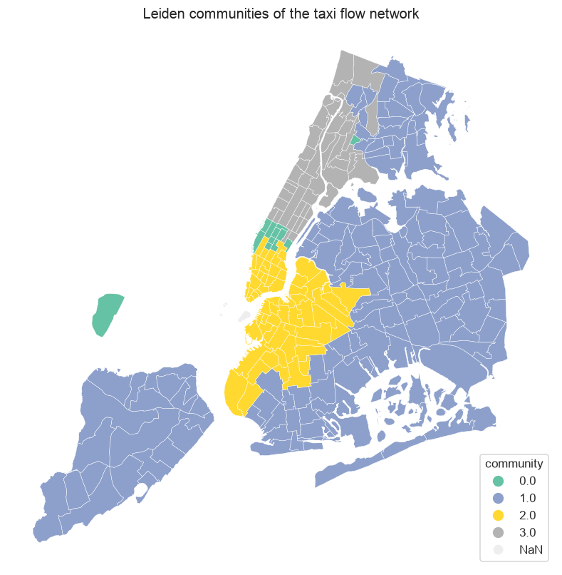
Running Leiden community detection on the same weighted, directed graph splits the city into four functional districts, which is the substrate clustering itself rather than me imposing a grouping.

The network colored into four Leiden communities, node size set by outgoing trips, districts cutting across borough boundaries
Leiden communities, node size set by trips leaving each zone over the year. The partition is seed-stable and redraws NYC by taxi connectivity, cutting across borough lines rather than following them.

Four is what falls out at the resolution I used, and the count is resolution- and seed-dependent, since a coarser resolution merges districts, a finer one splits them, and a sweep across resolutions returns anywhere from four to seventeen. What is robust is the structure at this scale: over 100 random seeds the count holds in the range three to four, with a mode of four and a mean Adjusted Rand Index of 0.751 between seed pairs, so the partition is stable to the stochasticity of the algorithm, and modularity is Q = 0.189, which sits at z = 13.8 above a weight-reshuffle null, so the districts are real concentrations of flow rather than an artifact of the method. About half the trips stay inside a single district, and the partition agrees poorly with both borough and service-zone labels, which is exactly the point, because taxi connectivity draws a different map than administration does, and it draws it straight off the weights.

Naming districts is descriptive, though, and to ask where Manhattan functionally ends I need a sharper lens: a model that predicts each pair’s flow from what the graph already obviously knows, so that whatever is left over is genuinely the part the obvious facts cannot explain.

Subtracting the obvious: where Manhattan ends

The flagship question, the one the map at the top of this post answered before I had shown any of the method, is whether a central neighborhood can behave, in taxi flow, like a far suburb, and getting from the substrate to that map takes three beats: how flow decays with distance, whether a gravity model fits, and then which zones the model cannot explain once you subtract everything it can.

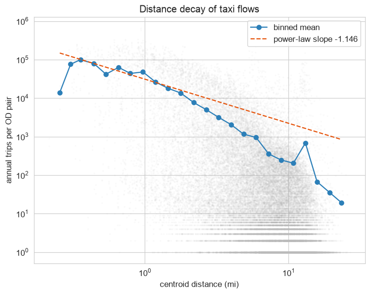
Flow falls off steeply with distance, which is Tobler’s first law of geography put in numbers[4].

Scatter of annual trips per origin-destination pair against centroid distance, with a fitted decay curve falling off steeply
Annual trips per origin-destination pair versus centroid distance, with the calibrated doubly-constrained decay exponent of 1.146. Flows fall off steeply with distance, which is Tobler's first law quantified for taxi travel.

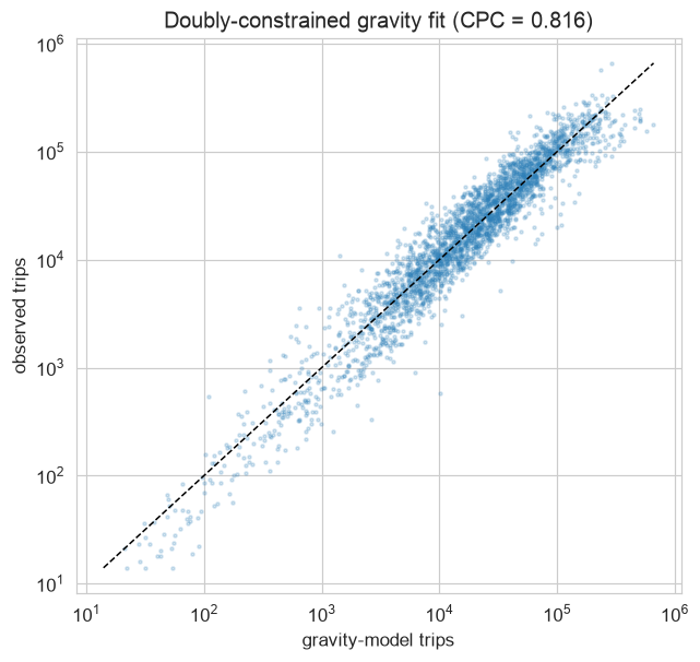
The model I lean on is a doubly-constrained gravity model, the Furness form, which conditions on only two things, each zone’s own marginals (both what it sends and what it receives) and the distance between every pair of zones, and because it knows nothing about a pair beyond those two constraints, the residual it leaves behind is non-circular: it is precisely the slice of flow that volume and geography alone do not explain, which is the only kind of residual worth mapping. The calibrated decay exponent is 1.146. An unconstrained Poisson fit returns a gentler exponent of 0.72, but it over-reconstructs the flows by leaning on the data it is supposed to explain, so I report it only as an exponent and never as evidence the gravity story holds.

The fit holds across the core, so the subtraction is well-founded before I read anything off it. Plotting observed flows against the model’s predictions, the common part of commuters lands at 0.816, which is a fair description of the city before any residual is read.

Scatter of observed origin-destination flows against doubly-constrained gravity-predicted flows, clustered along the diagonal
Observed versus predicted flows in the high-coverage core. Common part of commuters is 0.816; the points off the diagonal are the residual surprise mapped next.

Now the surprise, which is the same residual map you opened with. The doubly-constrained model gives each zone a deviance residual where negative means under-connected given its volume and central location and positive means over-connected. One caveat scopes the whole map: yellow-taxi pickups concentrate in the Manhattan core plus the airports, so the residual is only trustworthy in that high-coverage core, the TLC Yellow Zone plus the two airports, and everything outside it is greyed because the observation rate is too thin to trust. Even inside the core, the East Village’s nightlife trips by 2015 were increasingly green-cab and ride-hail rather than yellow, so part of its under-connected read may be a yellow-taxi blind spot rather than a pure mobility fact, which is why I read the colored zones as a claim about yellow-taxi flow, not about all travel.

Map of Manhattan-core taxi zones colored by gravity-model deviance residual, under-connected zones in blue and over-connected in red, with a ranked strip naming the extremes
Per-zone deviance residual from the doubly-constrained gravity model, scoped to the high-coverage core. Blue zones are under-connected given how central they sit; red zones are over-connected; greyed zones are too thinly observed by yellow taxis to trust.

Across the core the residuals span roughly -20 to +9, so the under-connected tail is the cluster of strongly negative zones rather than anything sitting near zero. The East Village lands at -5.1, the 29th percentile of the core, and Alphabet City at -4.3, the 35th, both well inside the under-connected tail, which is the graph drawing a functional edge of Manhattan that the geographic map does not. The wrinkle is that the Lower East Side itself comes out near neutral at +0.8, essentially indistinguishable from the model’s prediction, so where the eye lumps the East Village and the Lower East Side together the model splits the pair, and the suburb read holds cleanly for the East Village while being only qualified for its neighbor. The extremes are sharper than the downtown zones: the most under-connected are uptown, dense residential zones whose taxi flow falls well short of what their centrality predicts, with Upper East Side North at -20.3 and Upper West Side South at -16.3, while the most over-connected are the commercial spine, Times Square at +9.4 and Midtown South at +6.3.

That same off-diagonal scatter, the points that miss the gravity diagonal, hides a quirk that explains itself the moment you color it by rate code, which is the next lens on the same flows.

A lens on the fares: the constant-cost band

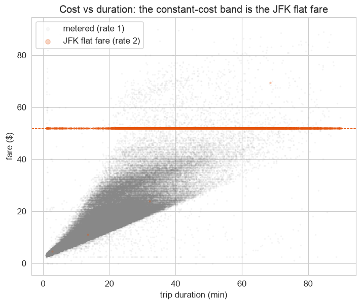
Plotting fare against duration over the same trips turns up a flat strip, a band of rides whose cost does not move with how long they took, and colored by rate code the band resolves to one thing.

Scatter of fare against duration, colored by rate code, with the flat band near 52 dollars highlighted as JFK flat-fare trips
Fare versus duration, colored by rate code. The flat band near $52, independent of duration, is the JFK flat fare (RatecodeID 2). 92.7% of trips in the $49 to $53 band are flat-fare.

It is the JFK flat fare: RatecodeID 2, a fixed $52 regardless of how long the ride takes. 2.19% of all trips fall in the $49 to $53 band, and 92.7% of those are flat-fare trips.

That was a static read of a whole year collapsed onto one graph, and the moment you re-time the same flows by hour, the suburb verdict on the East Village turns out to be half a story.

Re-timing it: day and night trade places

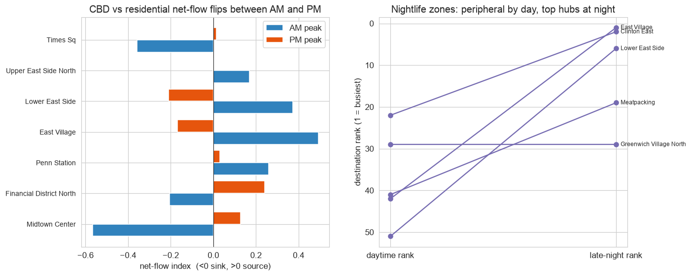
Split the flow by daypart, that is, build the same graph but on morning trips and evening trips separately, and the directional structure flips sign. A net-flow index, trips out minus trips in, normalised, runs Midtown Center as a sink in the morning at -0.567 and a source in the evening at +0.128, which is the classic central business district filling up at 9am and emptying out at 6pm, while the East Village is the mirror image, a source in the morning at +0.492 and a sink in the evening at -0.168.

Two-panel figure showing the morning-evening net-flow sign flip and the East Village rising from 42nd destination by day to 1st at night
Net-flow index by daypart. Midtown and the Financial District are AM sinks and PM sources; the East Village and Lower East Side are the mirror image. By late night, the East Village is the city's single busiest taxi destination.

The rank shift is what reframes the suburb story I drew off the static graph. From daytime to late-night, the East Village climbs from the 42nd-busiest destination to the 1st, the Lower East Side from 51st to 6th, and Clinton East from 22nd to 2nd, while the AM and late-night top-15 hub sets overlap by only about 0.20 by Jaccard, so the city has two largely different sets of busiest places depending on the hour. The suburb reading is a daytime-only effect, written entirely by where the nightlife is, which means the very same substrate, sliced on time instead of collapsed across it, contradicts and then completes its own flagship finding.

Those are the views I came for. A comprehensive read of one object, though, has to ask the harder network-science questions the friendly lenses gloss over, and several of those questions have tempting wrong answers that the density of this particular graph is happy to hand you.

More views of the same object: where the diagnostics bite back

This is not a separate findings track but four more lenses on the same graph, and it is the section where the easy claims get tested and several of them fail. Four questions, one figure each, every caveat carried.

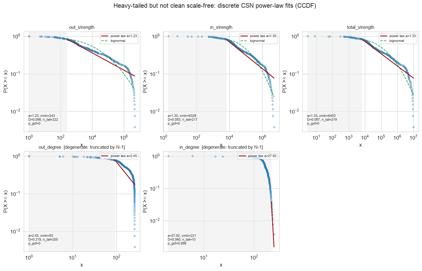
Is it scale-free? The heavy tails from the strength plots beg the question, so I tested it properly with discrete maximum-likelihood fits, a goodness-of-fit bootstrap, and Vuong model comparisons, the Clauset-Shalizi-Newman recipe.

Log-log complementary-CDF fits of in, out, and total strength with fitted power law and lognormal overlays
Clauset-Shalizi-Newman log-log fits. The strength distributions are strongly heavy-tailed and beat an exponential decisively, but the power law is KS-rejected and statistically tied with a lognormal: heavy-tailed, not a clean scale-free law.

The verdict is heavy-tailed but not scale-free. Out-, in-, and total-strength fit power-law exponents of 1.23, 1.35, and 1.33, all three below 2, which is the divergent-mean regime, but the goodness-of-fit bootstrap rejects the power law outright for all three (p_gof = 0), and each is statistically tied with a lognormal under a Vuong test (p = 0.65, 0.90, 0.59), which is visually indistinguishable on the tail. The strengths beat an exponential decisively and that is all I will claim. The in-degree fit reports an exponent near 28 on a tail of 10 points, which is a near-saturation artifact, since degree is truncated at N-1 on a near-complete graph, so the in-degree distribution simply runs into the ceiling and says nothing about scale-freeness; and with only 262 nodes the tail is too short to support a scale-free claim regardless. The label is tempting and wrong; I do not use it.

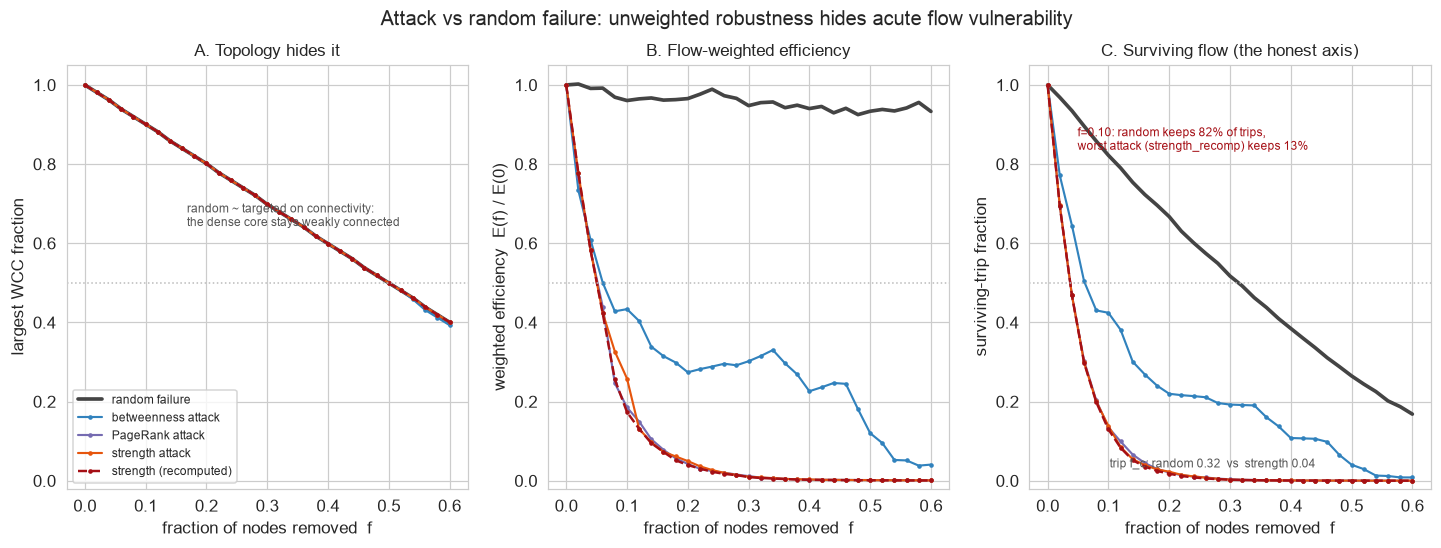
How robust is it? Remove nodes and watch what survives, random failure against targeted attack, on the same weighted graph.

Robustness curves: largest weakly-connected component, weighted efficiency, and surviving-trip fraction under random failure versus targeted attack
Robustness under node removal. Topology hides the story; flow-weighted efficiency and surviving-trip fraction fan out dramatically between random failure and targeted hub attack.

The naive answer is a trap, and again the density is the culprit. The Molloy-Reed criterion gives kappa = 365.5, far above the threshold of 2, so the random-failure critical fraction is essentially 1: the dense graph cannot be disconnected by random removal, which is a degenerate baseline of a near-complete graph rather than a finding about resilience. The axis that actually matters is surviving trips, and on that axis the picture splits. At a removal fraction of 0.10, random removal keeps 82.2% of trips and about 96% of weighted efficiency, while the worst targeted attack, removing the highest-strength zones with strengths recalculated after each removal, keeps only 13.0% of trips and about 17% of efficiency, with the trip-fraction critical fraction at 0.32 under random failure versus 0.04 under strength or PageRank attack. The unweighted largest-component curve stays near 0.90 under every strategy at that fraction, hiding the gap entirely, so the topology metric is blind to the very fragility the flow-weighted view exposes: robust to random failure, fragile to targeted hub removal, and you only see it if you weight by flow.

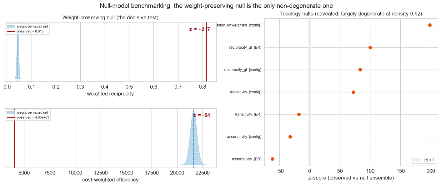
How non-random is the structure? Compare the same observed graph against null models.

Null-model benchmarking: weight-preserving null on the left with observed reciprocity and efficiency far in the tail, topology nulls on the right
Null-model benchmarking. The decisive test is the weight-preserving null; the topology nulls on the right are largely degenerate on a near-complete graph and reported as such.

The decisive test is the weight-preserving null, which fixes the exact observed topology and degree sequence and only permutes the trip weights across the fixed edges, and against it the observed weighted reciprocity of 0.818 sits at z = +217 and the cost-weighted efficiency at z = -54, so where the heavy flows sit, the mutual high-volume Midtown and airport corridors, is wildly non-random. The Erdos-Renyi and configuration topology nulls, by contrast, are largely degenerate on a density-0.62 near-complete graph, with ensemble variance so tiny that their z-scores are huge but uninformative, and the ER unweighted-efficiency z is undefined because the null standard deviation is exactly zero. I do not cite the topology-null z-scores as evidence; the structure that matters lives in the weights, not the wiring.

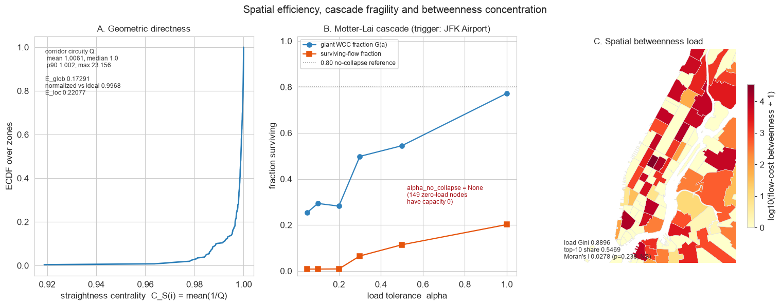
How geometrically optimal is it, and does it cascade?

Spatial efficiency diagnostics, a Motter-Lai cascade triggered at JFK, and a betweenness load map
Barthelemy spatial diagnostics plus a Motter-Lai cascade. The flow graph rides the street grid almost perfectly; its load concentrates in scattered hubs; the cascade result is real but partly a zero-capacity artifact.

Geometrically the same flow graph is near-optimal. Corridor circuity, the ratio of network to straight-line distance, has a mean of 1.006 and a median of 1.000; global efficiency is 0.173, which is 0.997 of the straight-line ideal; mean straightness is 0.997[5], so the Manhattan grid and the dominant Midtown corridors are essentially direct. The flow-cost betweenness load is concentrated, with a Gini of 0.89 and the top-10 zones carrying 54.7%, but it is not spatially clustered, since Moran’s I is 0.028 with p = 0.238, not significant, so the load sits in scattered hubs rather than one contiguous patch. A Motter-Lai load-capacity cascade triggered at JFK collapses the giant component at every tested tolerance, and that result is real but partly an artifact: 149 of 259 geometried nodes carry zero initial load, so their capacity is exactly zero and they fail on any rerouting, which means the no-collapse-threshold result is not pure hub fragility.

Every number so far is one year, one snapshot of the substrate, and the last thing left to do with the object is to rebuild it once a year for a decade and ask whether the shape survives a demand collapse the volume cannot.

Re-running it across the decade

This last section is a later revision: I came back to the 2015 graph years afterward and re-ran the identical pipeline across the full 2015 to 2024 yellow-taxi panel, so the COVID collapse and the 2024 recovery sit here on purpose, well past the year the original graph was built. The volume timeline is brutal.
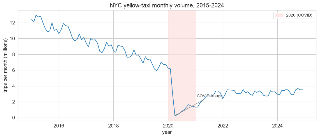
Monthly yellow-taxi trip volume stitched into one continuous 2015 to 2024 timeline, with a steady pre-COVID decline and a sharp 2020 cliff
Monthly yellow-taxi trips, 2015 to 2024. The steady slide from 2015 to 2019 is ride-hailing substitution plus a falling yellow-taxi share; the 2020 cliff is the pandemic; the climb after is an incomplete recovery.

Volume swings violently, with a coefficient of variation of 0.61: a mean of 69.7M trips a year, a low of 22.8M, a high of 135.7M. There is a 42% secular decline from 2015 to 2019 as ride-hailing eats the yellow-cab share, a 70.9% collapse from 2019 to 2020 when COVID empties the streets, and a recovery to only 48.6% of the 2019 level by 2024, so trips per year change by a factor of about six.
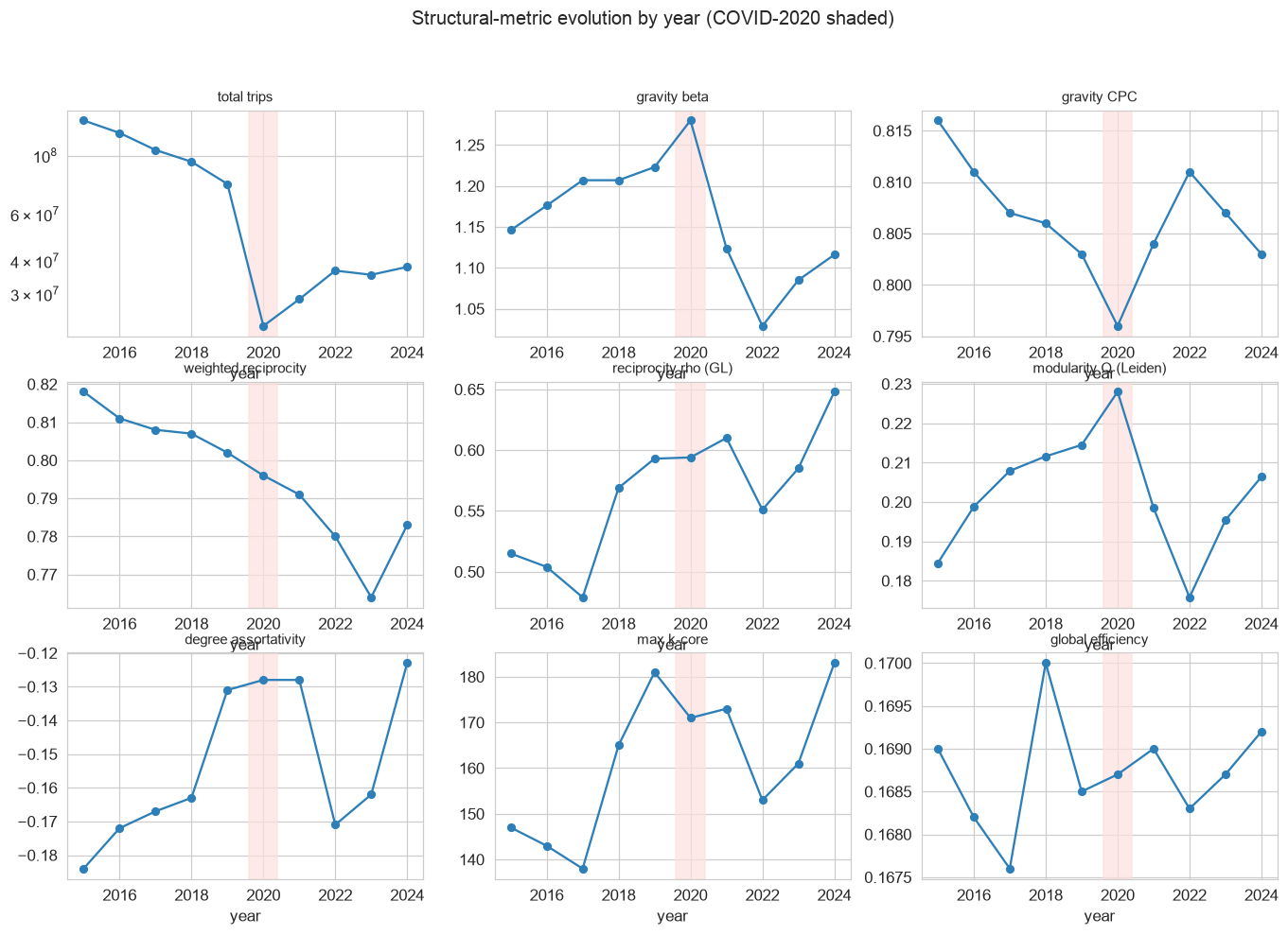
The geometry of the graph does not move.

Panel of per-year network metrics from 2015 to 2024 showing volume cratering while global efficiency, gravity fit, modularity, and community count stay nearly flat
Per-year network metrics, 2015 to 2024. Volume craters; global efficiency, the gravity distance law, modularity, and community structure barely register the shock.

While volume has a CV of 0.61, global efficiency has a CV of 0.004 and the gravity-fit quality (common part of commuters) a CV of 0.007, which are the two most stable quantities measured anywhere in this project, and the community count stays between three and four throughout. That cross-year stability is a different measure than the within-year seed test from the partitioning section, and the two should not be conflated: the seed test shuffled random seeds on the single 2015 graph and averaged ARI 0.751 between seed pairs, whereas this one compares each year’s partition to the next year’s. Across years, consecutive partitions align at an average ARI of 0.883, and the 2019-to-2020 COVID boundary itself scores ARI 0.943, meaning the functional districts did not re-draw under the shock. The one detail that shifts is the marquee: from 2020 on, the Upper East Side overtakes Midtown as the city’s top arrival hub, as commuting and tourism fall away faster than residential travel.

One caveat keeps those decade numbers honest, and it is the same yellow-taxi bias from the opening. This is yellow taxis only across every year, the yellow share of for-hire travel falls steadily as ride-hailing and green-cab trips rise, and TLC re-coded the trip schema across years, so the cross-year deltas conflate a real change in demand with a changing observation process, and the 71% and 42% should be read as movements in yellow-taxi volume specifically, not in all New York travel. What survives that caveat cleanly is the invariance: whatever the observation process, the geometry the graph measures holds its shape across a six-fold swing in how much flows through it.

Which is the whole argument for building the substrate in the first place, and the reason the map at the top of this post still reads true years after the year it was built. The volume of trips is weather. The geometry is climate. Collapse a year of arrows into one directed graph and you get the weather for free, but the thing to keep is the climate, the object underneath the noise, and it is the same object whether you weight it, partition it, subtract the obvious from it, re-time it, stress-test it, or run it again ten years later.

Explore the interactive project Browse the code on GitHub

References

  1. NYC taxi data: http://www.nyc.gov/html/tlc/html/about/trip_record_data.shtml
  2. Peng C, Jin X, Wong K-C, Shi M, Lio P (2012) Collective Human Mobility Pattern from Taxi Trips in Urban Area. PLoS ONE 7(4): e34487. doi:10.1371/journal.pone.0034487
  3. Dash Nelson G, Rae A (2016) An Economic Geography of the United States: From Commutes to Megaregions. PLoS ONE 11(11): e0166083. doi:10.1371/journal.pone.0166083
  4. Tobler W. A computer movie simulating urban growth in the Detroit region. Economic Geography 1970;46: 234-240.
  5. P. Crucitti, V. Latora, and S. Porta. Centrality measures in spatial networks of urban streets. Physical Review E, 73(3):036125, 2006.